

After going through the different versions of this logo, both Daria and I weren't exactly satisfied with this. I decided to play around with a few vector images I had and merge a few together to form an entirely new logo design, but one in which I felt reflected both the spiritual individual and gallery aspects of the studio (it doubles as an art gallery, hence the name Whole Body Gallery).
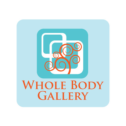
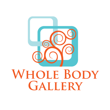
I first came up with these next two, using a cool blue and a contrasting, and complimentary colored, orange:
Then, after consulting Daria, we changed the final colors to the original organic green and hot orange red for the final logo design below:
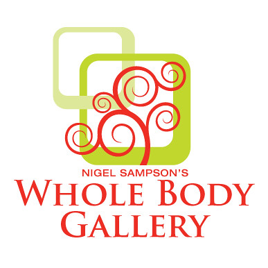
I think it represents the gallery very well, with both a sophisticated and serene look, with all the elements present, with the tree representing the individual and pilates aspects and the frames representing the art gallery.
Now, we are off to create the rest of the corp design, including business cards, stationary, and website (which should be up by the end of March, I hope). I will keep updating the progress.
No comments:
Post a Comment